The Intersection of Music and Data Visualization
Music and data visualization might seem like disparate fields, but they share a fundamental goal: to communicate patterns and evoke responses through structured information. In this post, I'll explore the fascinating intersection of music and data visualization, drawing on my experience as both a data scientist and an audio engineer.
One of the most direct applications of data visualization to music is the visualization of audio waveforms and spectrograms. These visualizations allow us to see the structure of sound, revealing patterns in amplitude, frequency, and time that might not be immediately apparent to the ear. For audio engineers and musicians, these visualizations can be invaluable tools for mixing, mastering, and sound design.
Beyond these technical applications, there's a rich tradition of creative visualization of musical data. From the classic music visualizers in media players to sophisticated interactive installations, artists and designers have found countless ways to translate the patterns of music into visual experiences.
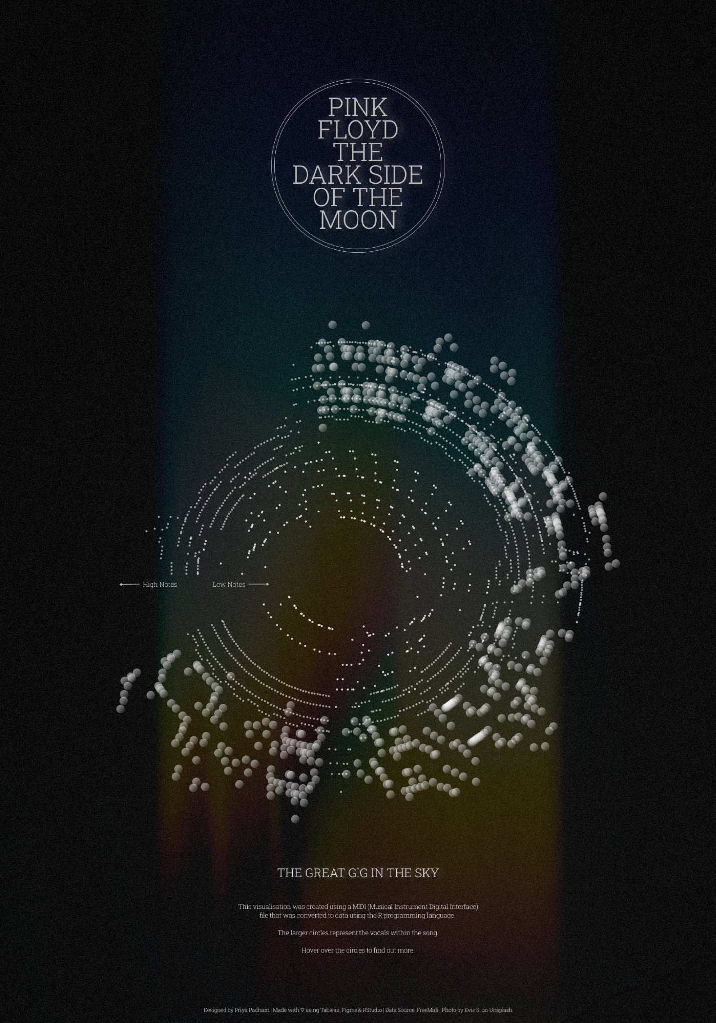
My own exploration in this area began with the MIDI to CSV Data Tool I developed, which transforms MIDI music files into analytical datasets. This tool allows for the extraction of musical structures—notes, rhythms, harmonies, and dynamics—into a format that can be analyzed and visualized using standard data science tools.
Using this tool, I've been able to visualize patterns in different musical genres, composers' styles, and even individual pieces. For example, by plotting the distribution of note durations and pitches in Bach's compositions versus those of Mozart, we can see clear differences in their compositional approaches—Bach tends to use a wider range of note durations and more complex rhythmic patterns, while Mozart's melodies often follow more predictable patterns.
Another interesting application is the visualization of musical form and structure. By representing different sections of a piece (verses, choruses, bridges) visually, we can create maps that reveal the architectural patterns of music. These visualizations can help listeners better understand and appreciate the structure of complex pieces.
The relationship between music and visualization can also go in the other direction, with data being sonified—translated into sound—rather than visualized. This approach, known as data sonification, can reveal patterns in data that might be difficult to perceive visually. For example, astronomical data can be mapped to musical parameters, allowing us to 'hear' the patterns of celestial bodies.
In my work as a live audio engineer at the University of Wisconsin Madison, I've experimented with real-time visualization of live performances, creating visual accompaniments that respond to the music being played. These visualizations can enhance the audience experience, providing a visual dimension that complements and enriches the auditory experience.
The intersection of music and data visualization offers rich possibilities for both analysis and artistic expression. By translating the patterns of music into visual form, we can gain new insights into musical structure and create compelling visual experiences that enhance our appreciation of music.
Whether you're a musician, a data scientist, or simply someone who appreciates both music and visual art, I encourage you to explore this fascinating intersection. The tools and techniques for visualizing musical data are becoming increasingly accessible, opening up new possibilities for understanding and experiencing music in visual form.