Data Visualization Best Practices
Data visualization is a powerful tool for communicating complex information in a clear and accessible way. When done well, visualizations can reveal patterns, trends, and insights that might be difficult to discern from raw data. In this post, I'll share some best practices for creating effective data visualizations based on my experience as a data scientist and analyst.
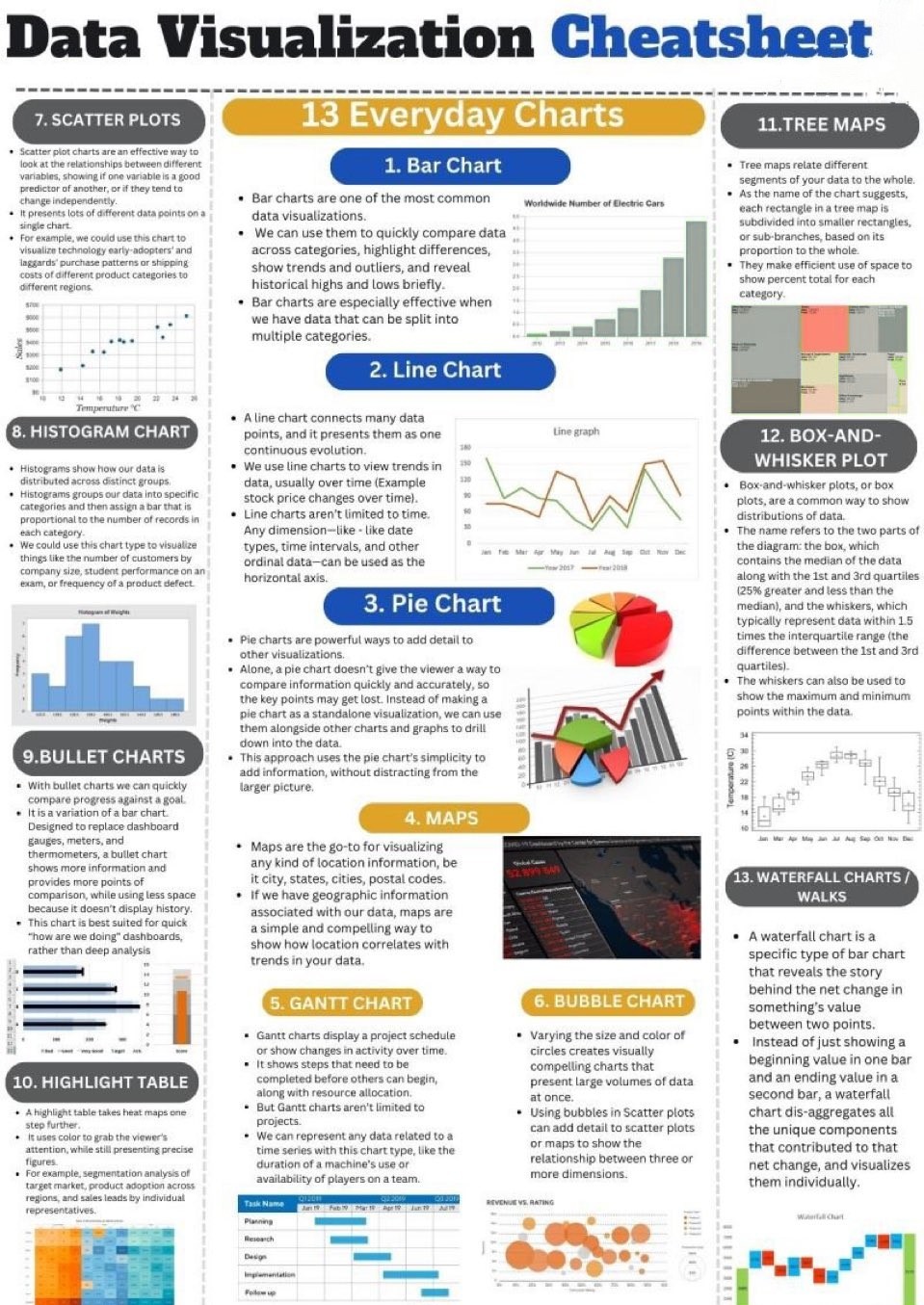
One of the most important principles of effective data visualization is clarity. Your visualizations should clearly communicate the key insights without unnecessary complexity or decoration. This means choosing the right type of visualization for your data and message, using clear labels and annotations, and avoiding chart junk that can distract from the main point.
For example, when creating dashboards for UW Transportation Services, I focused on presenting parking usage patterns in a clear and intuitive way. This involved using simple line charts to show trends over time, heat maps to display usage patterns by location, and clear color coding to highlight areas of high demand.
Another key principle is honesty. Your visualizations should accurately represent the data without distortion or manipulation. This means using appropriate scales, avoiding misleading comparisons, and providing context that helps viewers understand the significance of the data.
For instance, when presenting financial forecasts for Prayas Entertainment, I made sure to include historical data alongside projections, use consistent scales across different time periods, and clearly indicate the level of uncertainty in the forecasts.
Accessibility is also an important consideration in data visualization. Your visualizations should be accessible to as many people as possible, including those with visual impairments or color blindness. This means using color schemes that are distinguishable by people with color vision deficiencies, providing alternative text descriptions for screen readers, and ensuring sufficient contrast between elements.
In my work with Tableau and Power BI, I've found that interactive visualizations can be particularly effective for exploring complex datasets. By allowing users to filter, drill down, and explore the data themselves, interactive visualizations can provide a richer and more personalized experience.
For example, the dashboards I created for HP Tech Ventures allowed users to filter startup data by industry, stage, and other criteria, enabling them to focus on the specific segments that were most relevant to their investment interests.
Finally, it's important to remember that the goal of data visualization is not just to present data, but to tell a story and drive action. This means thinking carefully about the narrative you want to convey, the insights you want to highlight, and the decisions or actions you want to inform.
By following these best practices, you can create data visualizations that not only look good but also effectively communicate insights and drive better decision-making. Whether you're creating simple charts for a presentation or complex interactive dashboards, these principles can help you create visualizations that have impact and value.